The Elements of Graphic Design
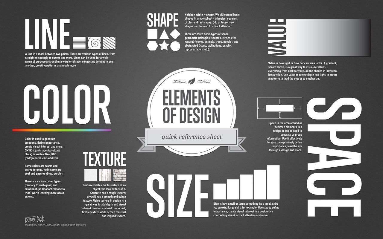
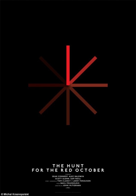
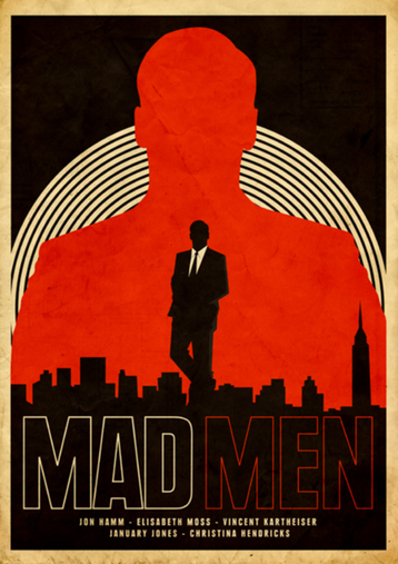
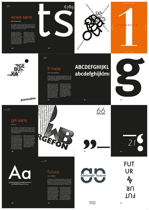
LINE

Line, in graphic design, can be used for a wide range of purposes: stressing a word or phrase, connecting content, creating patterns and more.
More Line examples below...
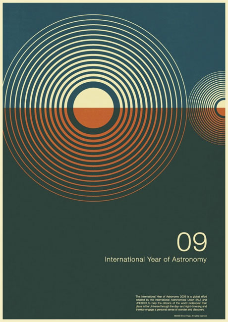
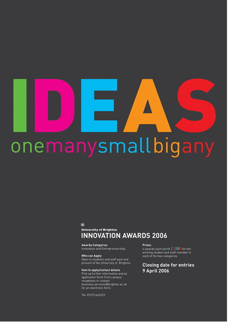
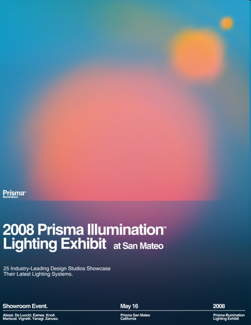
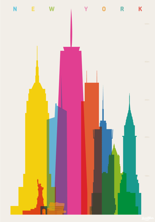
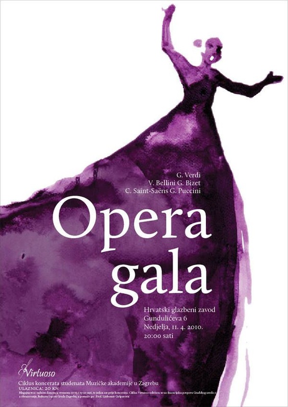
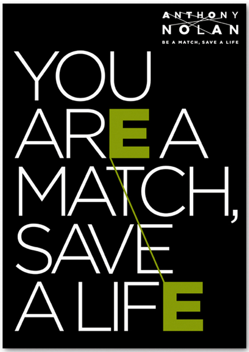
COLOR
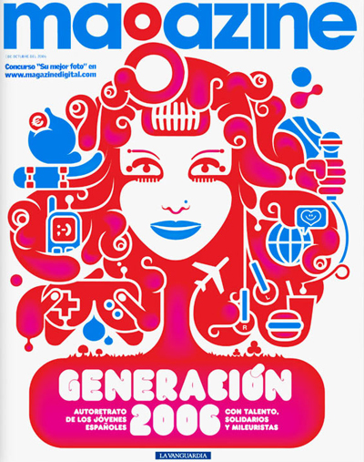
Color is used to generate emotions, define importance, create visual interest and unify branding.
More Color examples below...
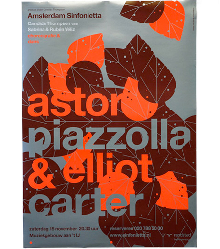
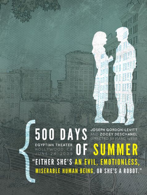
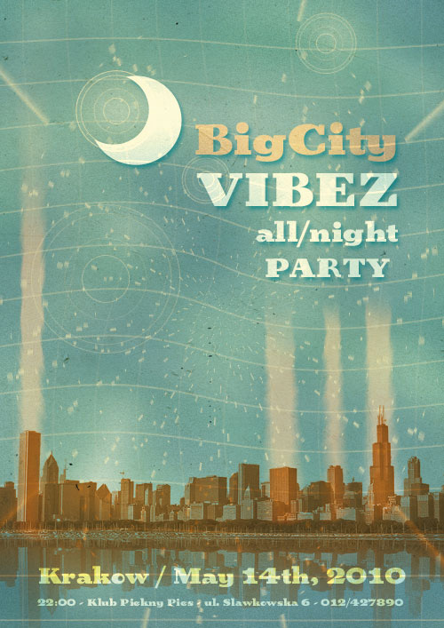
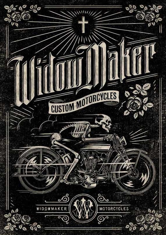
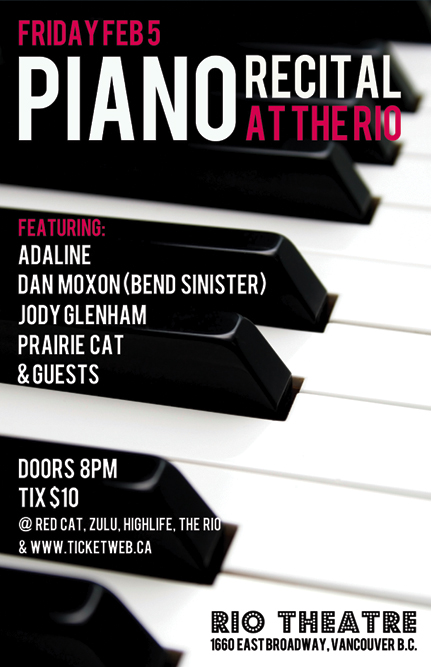
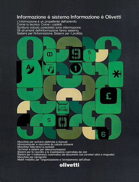
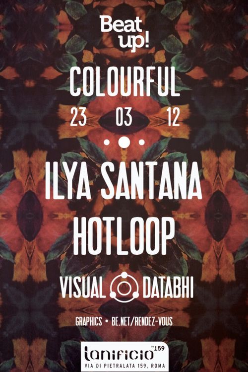
TEXTURE

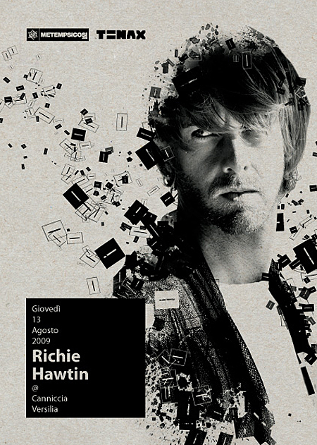
Texture relates to the surface of an object. Using texture in graphic design adds depth and visual interest. This can be applied graphically in the form of pattern or through the choice of printable surface.
More Texture examples below...

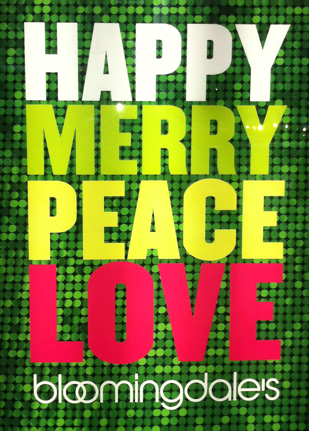
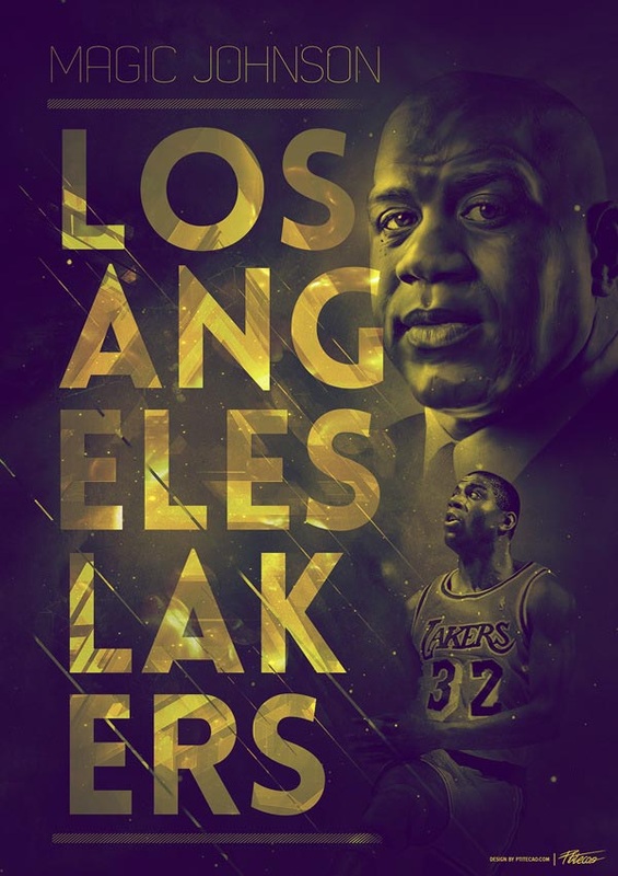
SCALE
In graphic design, Size or Scale is used to convey importance, attract attention and create contrast.
More Size examples below...

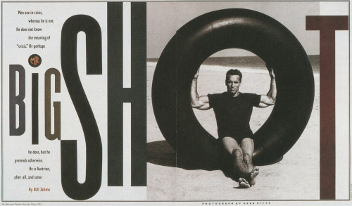
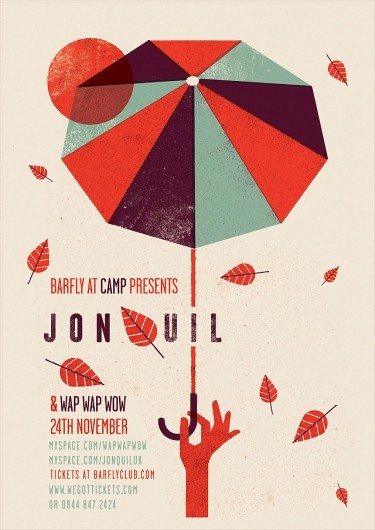
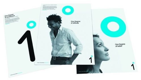
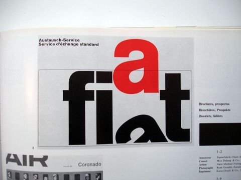
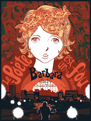
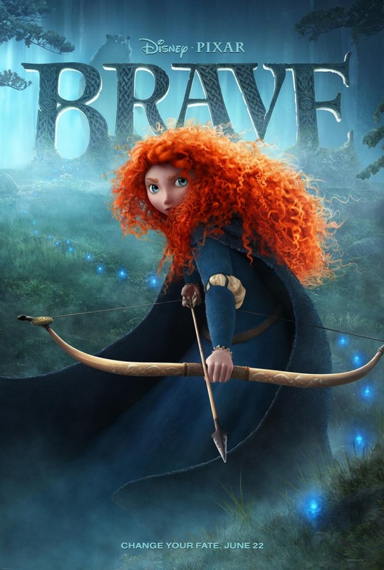
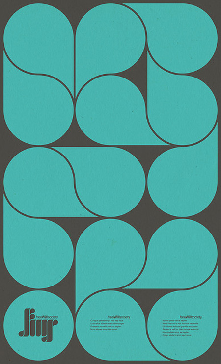
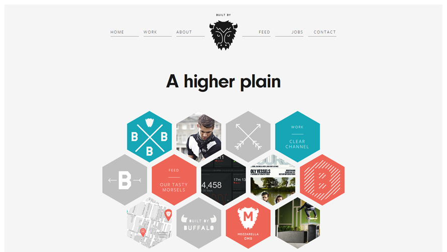
SHAPE
Shape: The three basic shape types are Geometric (Circles, Squares, Triangles etc.), Natural (leaves, trees, people etc.) and abstract (icons, and graphic representations). Use carefully to create a visually pleasing design and eye-catching design.
More Shape examples below...

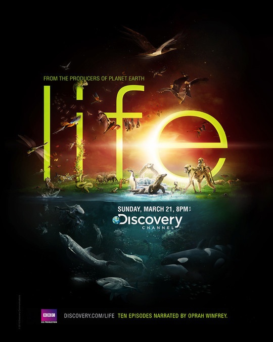
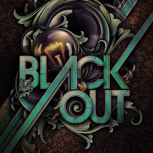
VALUE
Value is how light or dark an area looks in a design. It is everything from the darkest of blacks through to the brightest of whites. Used correctly it will create depth, contrast and emphasis.
More Value examples below...

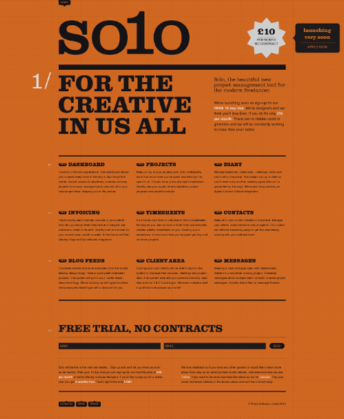
The Principles of Graphic Design
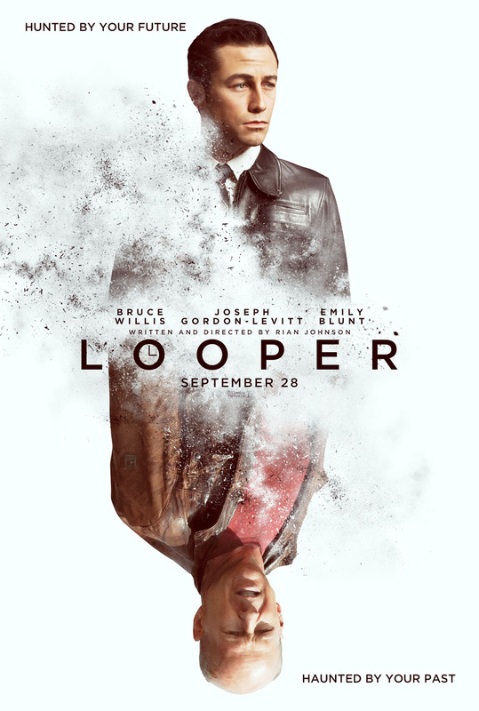
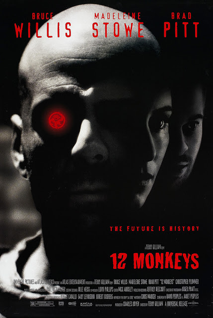
EMPHASIS
Emphasis is created by contrasting size, positioning, color, style, or shape. The focal point should dominate the design with scale and contrast without sacrificing the unity of the whole.
More Emphasis examples below...

BALANCE
 Symmetrical Balance Example Symmetrical Balance Example
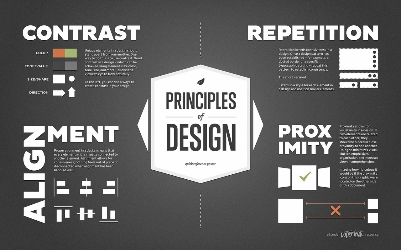
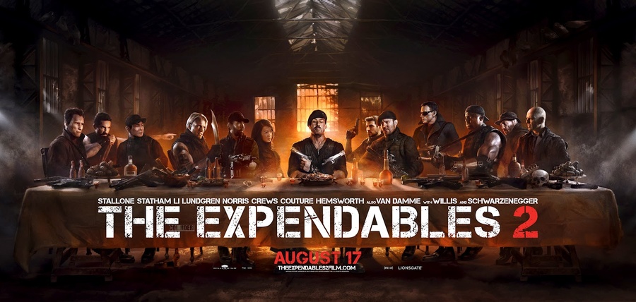
Balance in design is similar to balance in physics. A large shape close to the center can be balanced by a small shape close to the edge. Balance provides stability and structure to a design. It’s the weight distributed in the design by the placement of your elements. More Balance examples below... |
Asymmetrical Balance Example
|
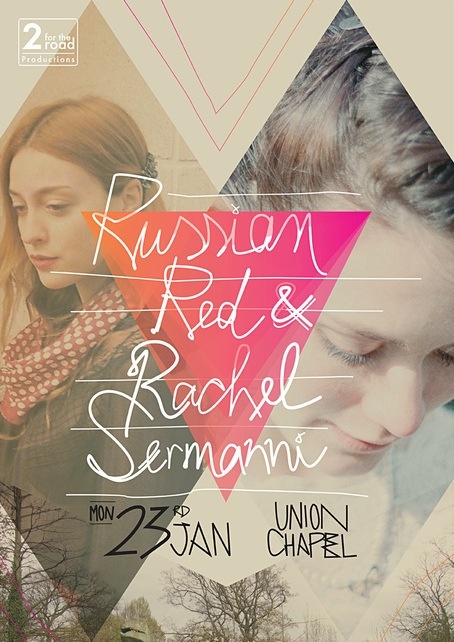
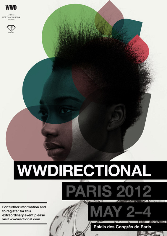
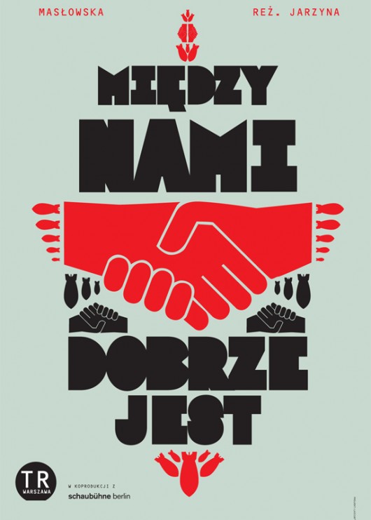
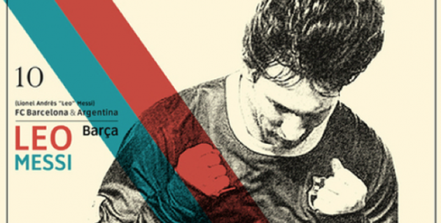
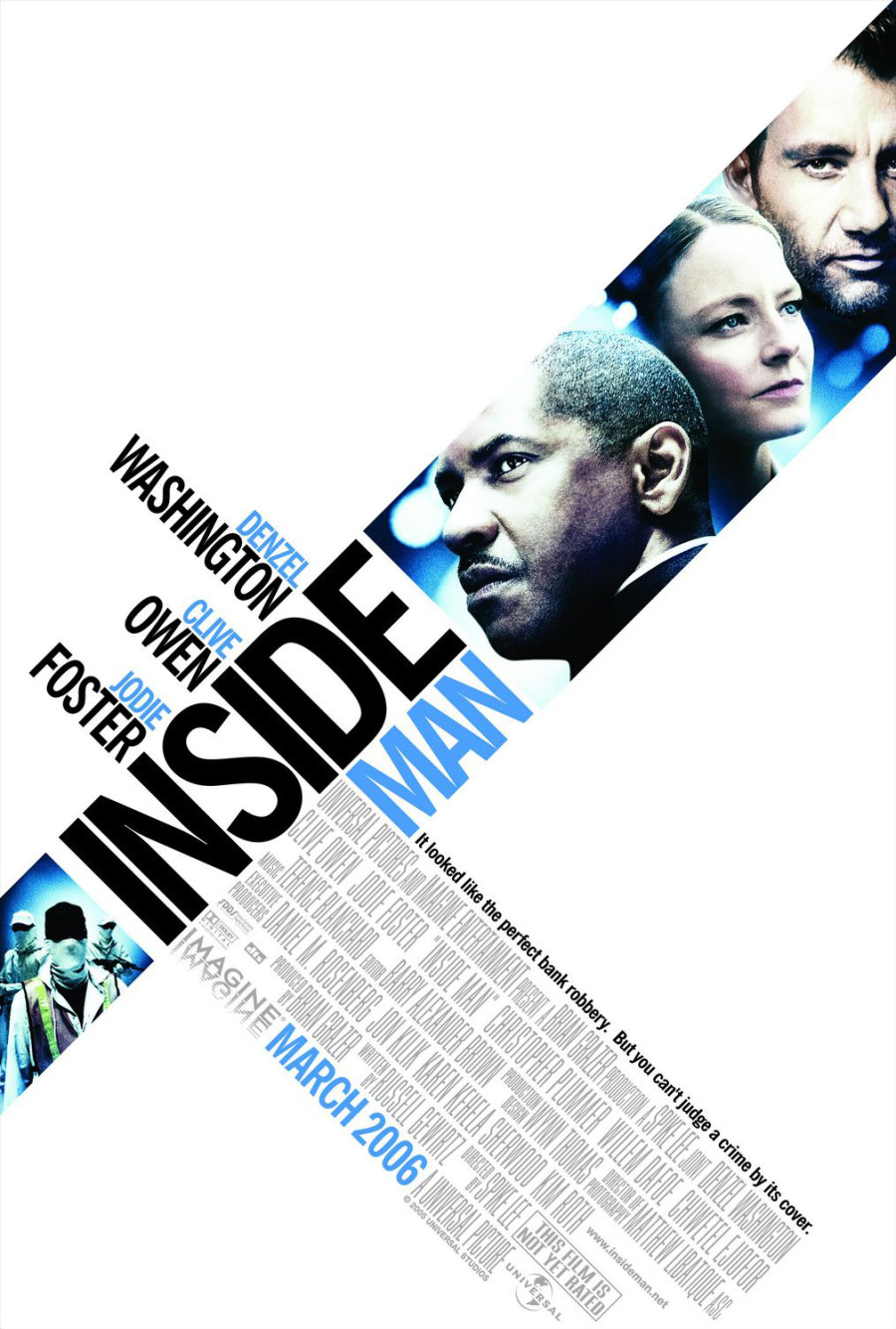
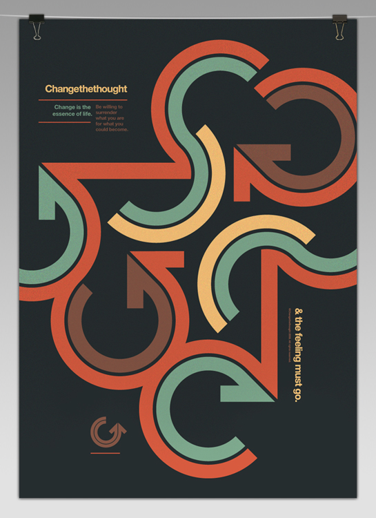
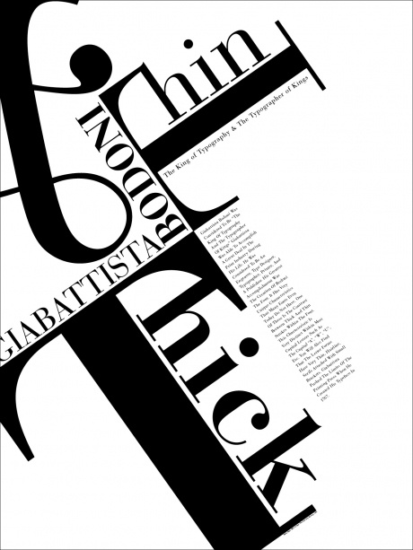
CONTRAST
Contrast is the juxtaposition of opposing elements (opposite colors on the color wheel, or value light / dark, or direction - horizontal / vertical). Contrast allows us to emphasize or highlight key elements in your design.
More Contrast examples below...


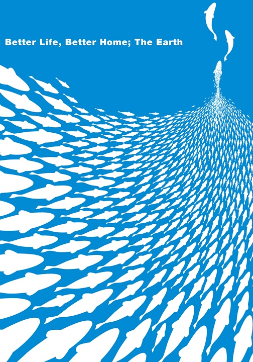
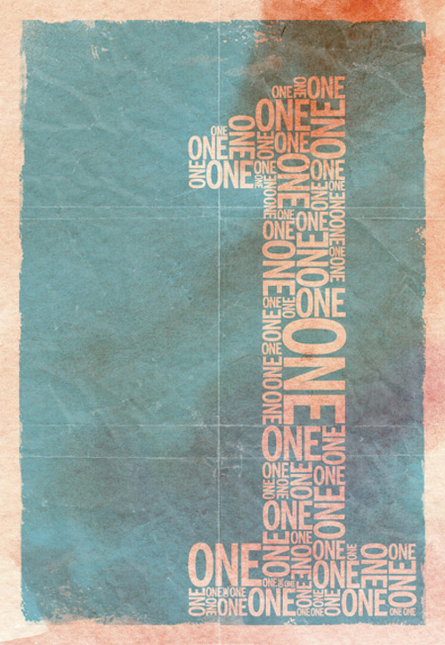
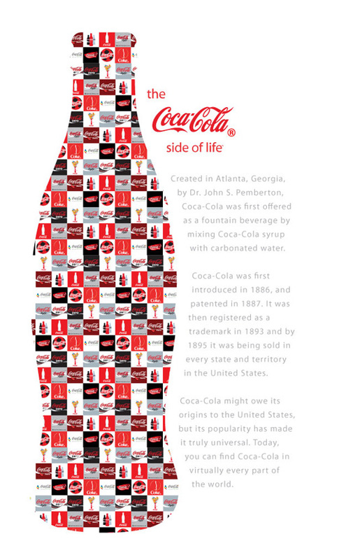
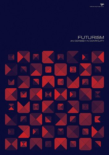
REPETITION
Repetition strengthens a design by tying together individual elements. It helps to create association and consistency. Repetition can create rhythm (a feeling of organized movement)
More Repetition examples below...

PROXIMITY
Proximity creates relationship between elements. It provides a focal point. Proximity doesn’t mean that elements have to be placed together, it means they should be visually connected in someway.

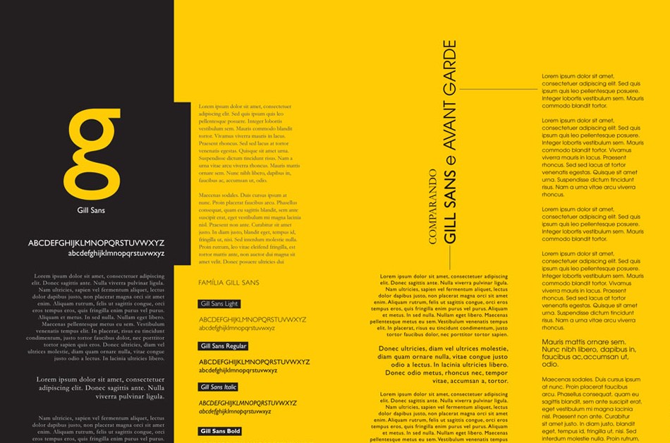
ALIGNMENT
Alignment allows us to create order and organization. Aligning elements allows them to create a visual connection with each other and helps with readability.

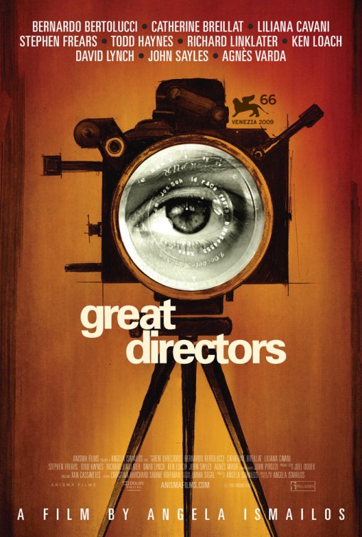
HEIRARCHY
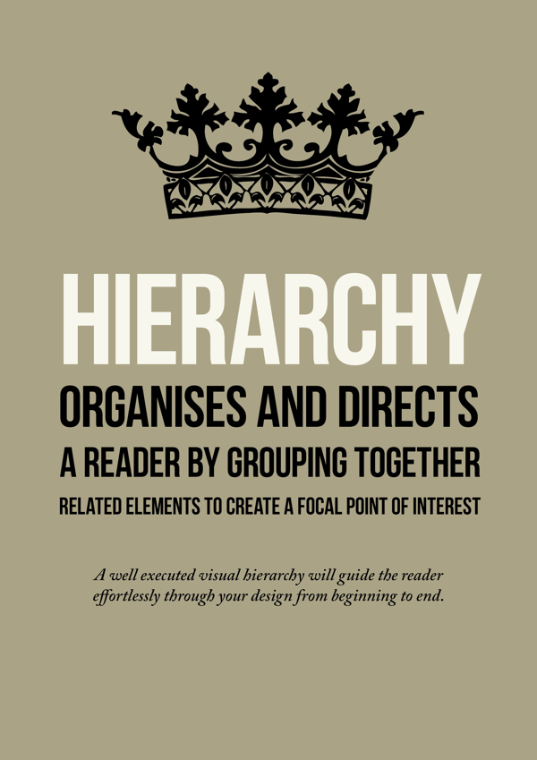
Hierarchy - A good design contains elements that lead the reader through each element in order of its significance. The type and images should be expressed starting from most important to the least important.