Page Layout Design Principles
Page layout is the part of graphic design that deals in the arrangement of visual elements on a page. It generally involves organizational principles of composition to achieve specific communication objectives.
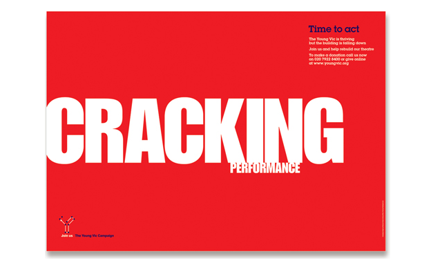
Focal Point
This is another important one because the focal point is the one who gives the viewers something to look at. The focal point adds a more specific idea to the design and acts as a starting point for most of the visitors. The focal point can be represented through simple typography, a button, illustration, a picture or any other element. It is totally up to the designers which is the way he wants to create a focal point through.
This is another important one because the focal point is the one who gives the viewers something to look at. The focal point adds a more specific idea to the design and acts as a starting point for most of the visitors. The focal point can be represented through simple typography, a button, illustration, a picture or any other element. It is totally up to the designers which is the way he wants to create a focal point through.
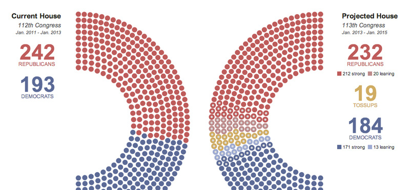
Hierarchy
Present the information in an organized fashion with the most important info first. Larger items get read or seen first. Colors can also be used to draw attention for hierachy.
Present the information in an organized fashion with the most important info first. Larger items get read or seen first. Colors can also be used to draw attention for hierachy.
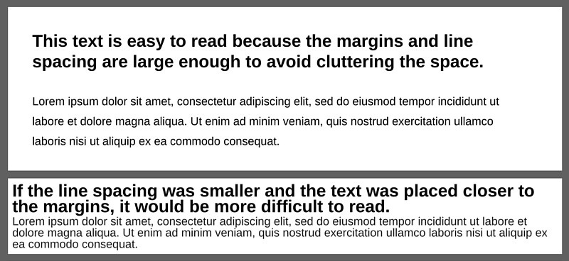
White Space
Don’t overcrowd the page. Organize the information so that there is space between items, reduce text to its minimum amount of copy where possible. White space refers to the areas in your design that do not contain content, including the larger spaces between design elements and the tiny spaces between letters. It doesn’t have to be white.
Don’t overcrowd the page. Organize the information so that there is space between items, reduce text to its minimum amount of copy where possible. White space refers to the areas in your design that do not contain content, including the larger spaces between design elements and the tiny spaces between letters. It doesn’t have to be white.
Contrast
Use contrasting fonts, and/or contrast in size, color, weight, form, direction. Use color contrast effectively.
Use contrasting fonts, and/or contrast in size, color, weight, form, direction. Use color contrast effectively.
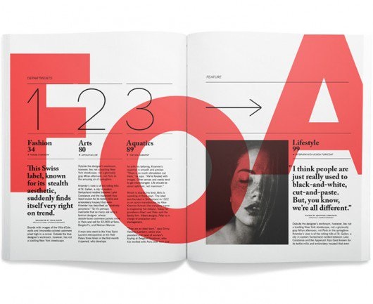
Repetition
Repetition is simply the process of repeating elements throughout a design, or several pieces of design collateral to give a unified look. You can think of it as adding consistency to a design.
Repetition is simply the process of repeating elements throughout a design, or several pieces of design collateral to give a unified look. You can think of it as adding consistency to a design.
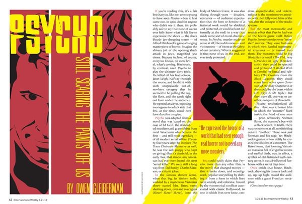
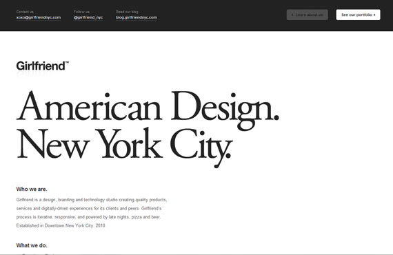
Alignment
The concept of alignment says that everything on a page should be visually connected to something else on the page. Nothing should be placed arbitrarily. When elements are aligned they are connected to each other, even if they are separated on the page.
The concept of alignment says that everything on a page should be visually connected to something else on the page. Nothing should be placed arbitrarily. When elements are aligned they are connected to each other, even if they are separated on the page.
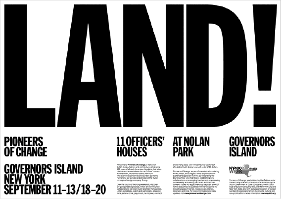
Proximity
The concept of proximity says that related items should be grouped together. Likewise, items that are not related should not be close to each other.
The concept of proximity says that related items should be grouped together. Likewise, items that are not related should not be close to each other.